


Have you ever had to embroider over a high-contrast, busily printed background material? I certainly have on many occasions. I’ve been called on more than I’d like to admit to provide options to an unhappy customer who has had such done by a previous decorator with no eye for contrast. The poor customer has usually ended up with a garment bearing their standard logo, stitched in its usual colors, rendered illegible by the competition with the loud ground image on which it was stitched.
If you have struggled with this all-too-common problem, my latest article in April’s Printwear Magazine covers some simple ways to alter the logo at hand as well as some information to consider about how, and if, you should be ‘fighting’ to regain contrast at all.
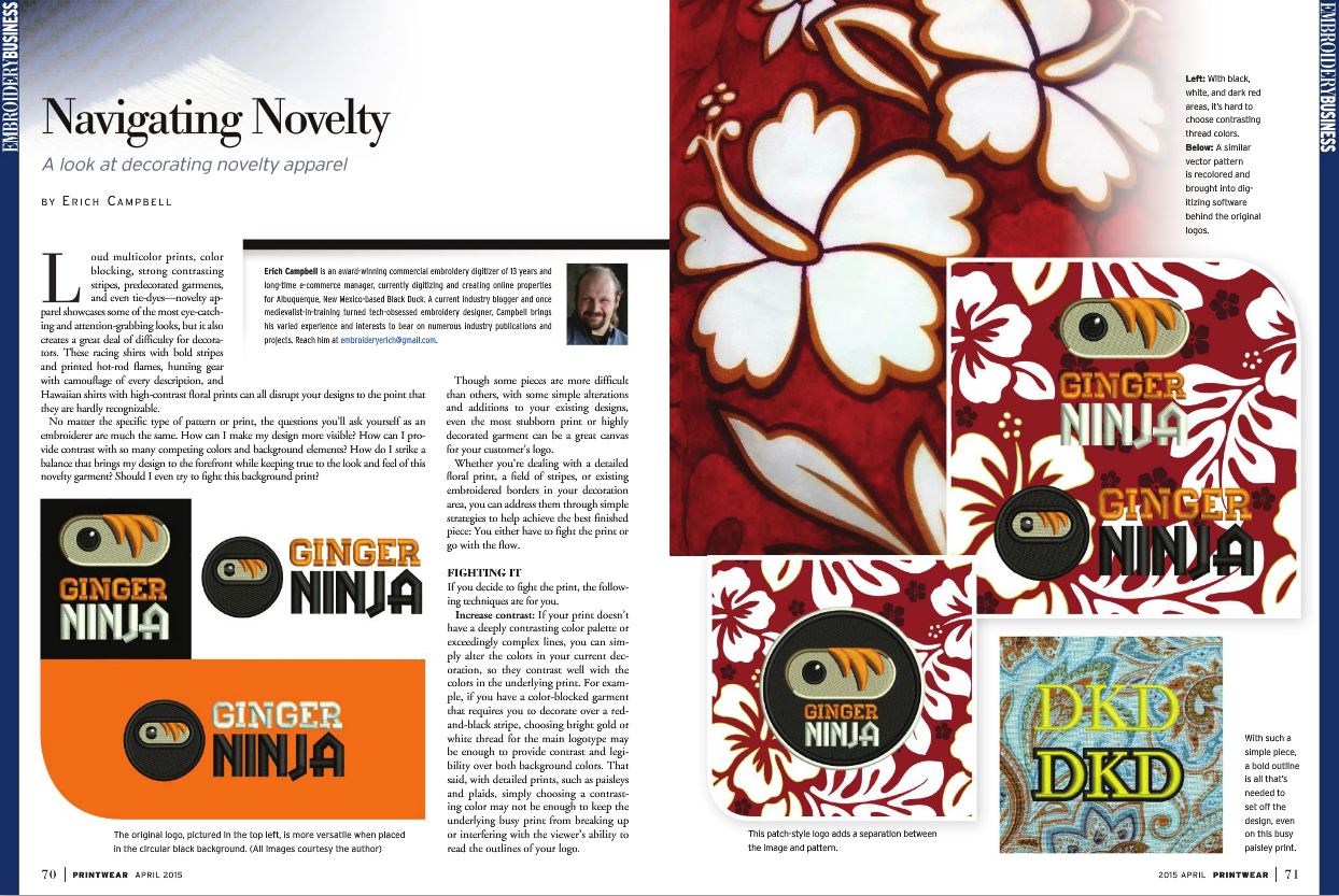
Though the concepts in the article are simple, the visual representations of the logo embroidery and the explanations attached may be the easy to read,readily intelligible examples you need to educate your client about their options for decorating novelty/printed materials. Here are the high points, in summary:
Fighting the print:
- Increase contrast through selecting colors that stand apart from all of the colors in the print, if you can. (not likely)
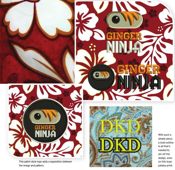
- Set off simple elements with an outline that separates them from the background
- Change Location – On garments that only have a difficult pattern/print in the standard decoration area, move the logo to a new placement that doesn’t carry the print.
- Cover it up – use any one of a number of methods to cover the print with a solid-colored element atop which you can stitch your logo.
Embracing the print:
- Use the print as a design element: Pick up shapes/colors in your print and design a new version of your decoration just for them; consider using negative space to allow the print to show-through and become part of your design.
- Blend In- Alter the color of the logo to match the palette of the print and allow it to blend in, maintaining the tone of the ground decoration for an understated look.
- Accessorize- Don’t decorate the loud print at all! Find an accessory or apparel item that coordinates with the printed item your customer has requested and decorate that instead to create an outfit that keeps the print, and the clear decoration.
In the article, I was lucky enough to be able to share a logo I created for a conspicuously red-headed friend’s business venture. He is currently occupied sharpening and making accessories for high-end Japanese cooking knives, hence the Ginger Ninja. I don’t always get to create logo concepts from scratch, so I’m pretty happy to be able to share one of my own pieces with everyone in the industry.
So, if you’d like to see one of my personal projects in the pixels and/or learn a little about how you can decorate on distractingly printed garments, please check out the article now!
Great examples of how to make a logo work on multi color backgrounds. It’s a difficult task that you have showed how to master.
Thanks, Bonnie! 🙂 I don’t think I said anything that wasn’t common sense, but I think it’s a good set of simple examples for folks. 🙂

Great representation with the logos on backgrounds, some crazy stuff comes through the door.
The next best difficult work…camo…always a challenge for the customer but much loved by them for gear.
Don’t I know it! In the full article I show an example on a ‘natural’ branded camo; it’s never easy to make that compromise if your customer doesn’t get a feeling for the way the colors interact. I always thought it was funny that something meant to keep you from being seen had become a fashion statement. 😉