


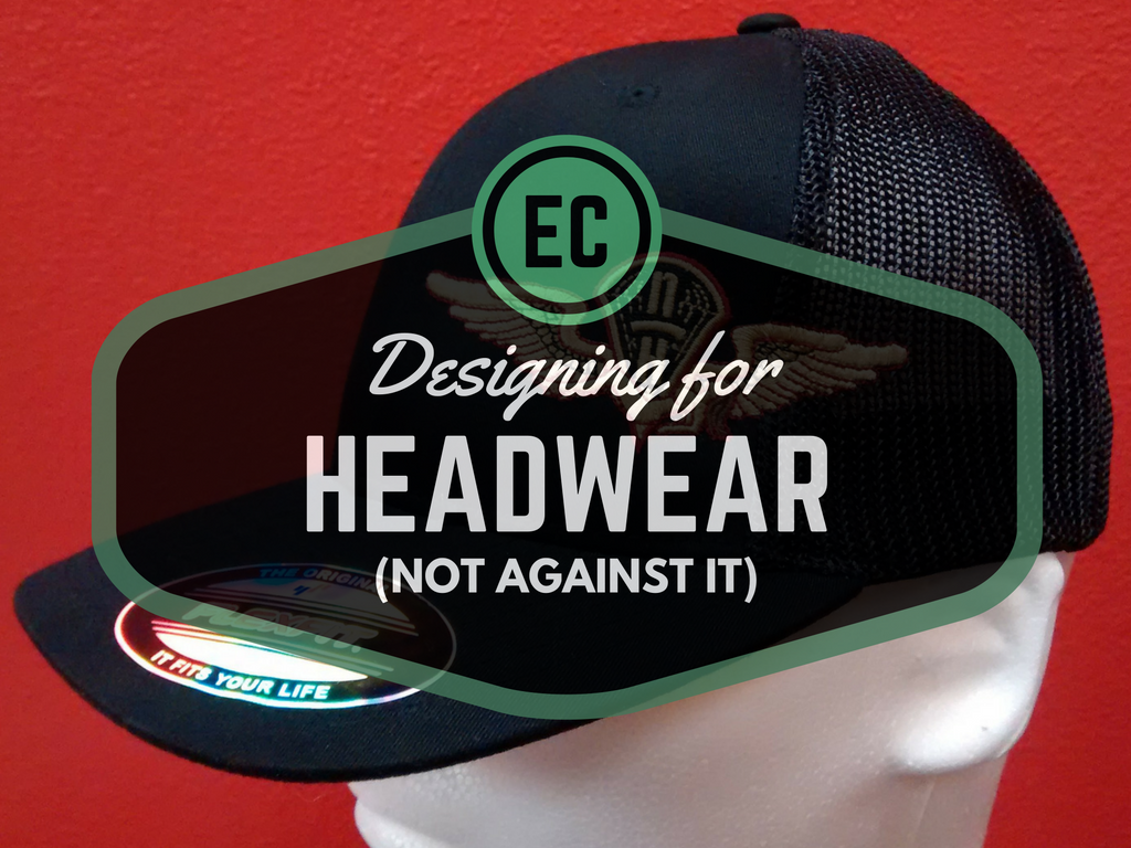
Headwear success can have as much to do with the design of your source art as it does with digitizing and embroidery execution.
This week, I hosted a live webinar on embroidering caps (linked here and embedded at the bottom of the post) with the excellent crew at Madeira USA. If you know machine embroidery, you’ve heard of Madeira thread. This means enough people listened to make me sweat my information; Headwear decoration is a struggle for many embroiderers, so I went deep on embroidery execution and technique. What I didn’t cover in as much detail is the effect that art and design can have on the process.
It’s a surreal feeling to research thread and see ads for the webinar you are about to host.
I’ve written articles about hats dealing with both design and technical execution. Two stand out; the different but similarly-named Headwear Headaches? No-Sweat Techniques for Tackling Tough Headwear, and Common Cures for Headwear Headaches. These articles cover everything from a brief talk on design to the technical aspects of underlay, sequencing, knit-hat texture, and everything that I brought to the live presentation- I’d implore you to check them out if you want the full magazine-reading experience. For the rest of you blog-lovers, however, what follows is the missing material from the webinar; a brief discussion of three concepts; Designing for headwear’s limitations, designing apparel holistically, and coordinating, rather than replicating, in your apparel branding.
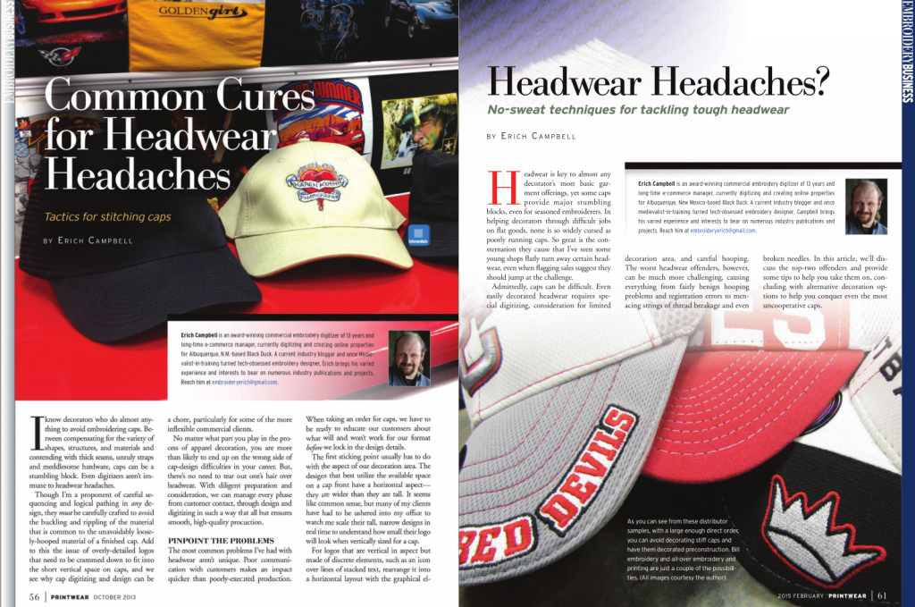
That pairing of Headwear and Headaches must have been too tempting for my editors to avoid.
First things first; some designs just don’t translate particularly well to headwear.
Headwear is almost universally restrictive in the vertical dimension. The area that you can decorate on any given cap is short and wide; On a standard, 6 panel cap, you’ll have less than 2 1/2 inches of vertical space to make your mark, whereas you have some 6 1/2 inches of horizontal space between the seams of the front panels. On something like a military cap, you may have as little as 1 1/4 inch of space above the horizontal seam in the crown. This means that tall, narrow designs will create very little coverage when reproduced on hats, and any small details in these designs will become painfully tiny.
Think of the front of a cap like a billboard; because as a promotional product, it essentially is one. If you want people to see what’s on your billboard, you want your message to be large and legible as you drive by. The same is true of a hat; anything you want to be seen has to be visible from the distance of a handshake. Tall, narrow designs must shrink proportionally to fit in the reduced vertical space; this makes them even smaller horizontally, making any small details and text less likely to be visible or legible. If we put a tall, narrow ad in the center of our imaginary billboard, it’s easy to see how it wastes all the horizontal space it could be using to communicate its message. The same goes for tall, narrow designs on hats, though you don’t want to cover every hat with embroidery from seam to seam, customers want people to see and be able to readily identify their designs, and the best way to make sure they get their message across is to make better use of that horizontal space.
Which one of these could you read at the Handshake Distance?
This is why I advocate designing apparel decorations holistically.
When I suggest that we take a holistic approach, I mean that we should take all the variables of our job into account as we do our initial design work. In this case, I mean that we should design our decoration specifically for the garment we intend to decorate. For hats, it means that even though we may traditionally use a tall, narrow logo or logotype, we should create a hat decoration, meant specifically for that application, that uses elements from our logo, or provides a take on our branding that makes the best use of the space available and, in the best cases, even takes the qualities of the specific hat into account.
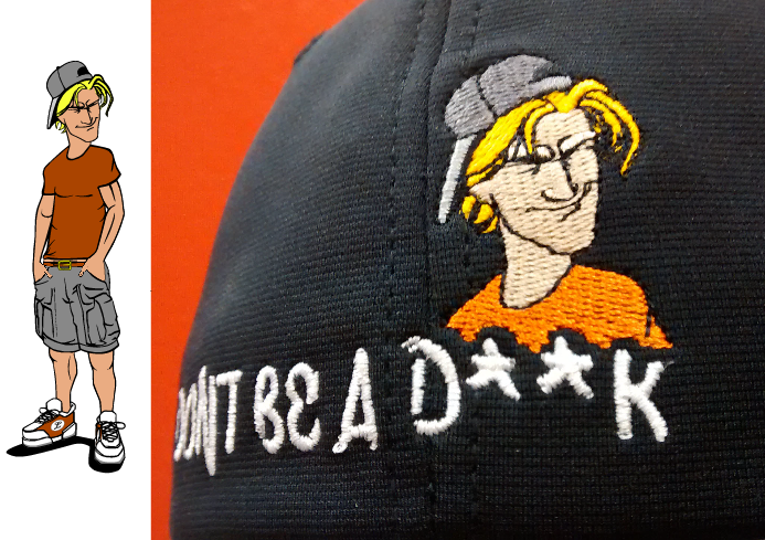
The design at left is what was originally intended for this cap back, but the important detail of the facial expression would have been minuscule- the customer elected to let us re-design and use a detailed version of the face from the design to increase its impact.
Think of retail hats for sports teams or large brands; they create novel , impactful decorations recognizably branded and clearly belonging to the team or company- they don’t reproduce an identical logo in the same fashion on every type of hat or garment. Bringing this retail attitude to designing expands our opportunities; if we can create something that’s identifiable to the brand or design that the customer brings us but makes a better use of the horizontal real-estate available with headwear, we can increase the value of that we deliver to the customer (better recognition and a higher-quality look) while we decrease the trouble we might have in reproducing a poorly suited logo (overly small/dense details, illegible lettering, trying to use overly large design sizes that cause registration issues at the top of the crown, etc.)
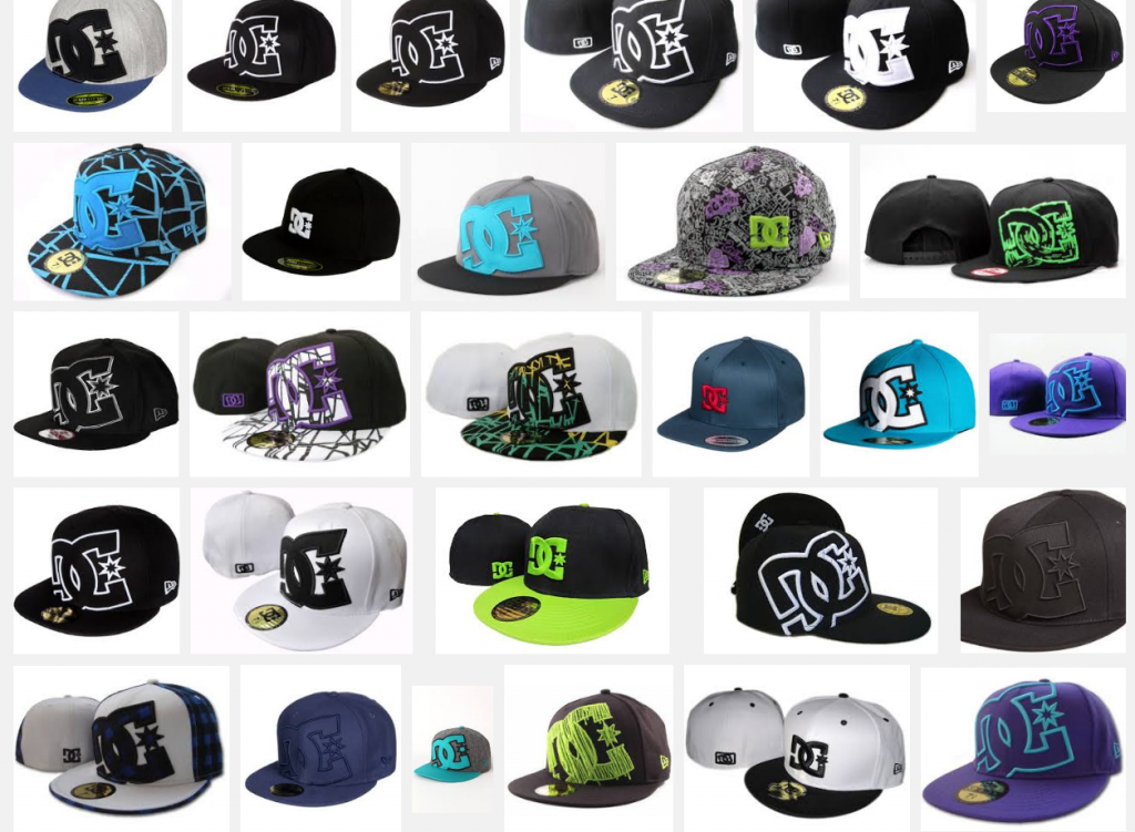
A Google image search of hats from popular skate shoe and apparel brand DC show that though they have a simple logo that’s easy to reproduce, they do understand how to make variation on a theme. All are recognizably DC products despite a wide range of treatments.
How does this play into designing for our average customer? We don’t have to extend into streetwear to find reasons to add simple variations to a line. For the piece from the Santa Fe wine and Chile festival that I showed during the webinar (admittedly as an example of a crooked-hooping reject) the example was in taking the text present in their original tiny circular logo, and creating a military hat specific design that allowed the important information ( the name and location of the popular festival) to be legible, both for promotions as and a keepsake that wine and chile aficionados would wear proudly as souvenirs. You can see in the example below- if we had stayed with the original circular design at the maximum size the cap allowed, the small text would have been impossible to make out from any distance. Though this version of the logo with the additional type never appeared in any other format, it made absolute sense for the military caps- it was a perfect complement to the shirts and accessories that allowed us to print their circular logo in a larger format that made text easy to read.
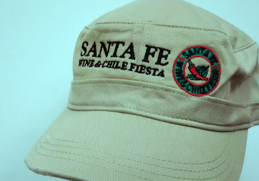
Crooked though this rejected sample may be, you can see how much less impact the round logo alone might have had at this size- the addition of the text added a massive amount of recognition.
Coordinate. Don’t Replicate.
This fit we achieved for the overall package of merchandise is what I mean when I say “coordinate, don’t replicate”. Rather than use the same art in every instance, we tailored the art to the garment, and made each garment make sense as part of a collection of garments and accessories the customer wanted to offer. Though it’s especially important with the limitations (and opportunites) presented by headwear, but still true for any decorated apparel and accessories is the fact one logo/treatment isn’t the best for every situation. What works on a left chest design may not make sense or even be physically possible for a hat design. Create coordinating designs that refer to the branding of the main logo without always replicating it, and you can achieve a more retail-inspired, stylish look for your customers.
All in all, it’s true that some customers may prove inflexible or not have the imagination to see the benefits of these stylistic variations. Not every customer wants a retail look or has the budget to have more than one design direction explored- that said, simply having these avenues opened to them may help them to consider the way that their design will look when you must make compromises to serve the needs of their selected headwear. If nothing else, a thought toward the holistic approach will make you more likely to advance creative options and give you a way to sell the necessary changes you must make as desirable parts of a design ethos that adds value to their purchase.
UPDATE:
If you’d like to see the webinar, look no further! Despite having been out for some time, I’m happy to answer questions. Please comment on this post with any you may have!
Erich, this article was extremely helpful for me. I presently have the same kind of challenge, I’m going to “crop” off some of the design so I can make the facial features recognizable. Very much like your example of the guy design presented above. Yours gives me the “can do” attitude to begin, thanks! 🙂 Lollie Conn, Oregon
I’m glad I can bring you a little of that ‘can do’ spirit. You can do it!

Erich, I enjoy these information-packed posts very much! Thank you for linking out to the Printwear articles on headwear embroidery — that “mesh underlay” technique for knit hats is absolutely brilliant. I’ve never tried to embroidery a beanie, or anything that ribby, but now I’m looking forward to trying it. Suddenly sweaters don’t frighten me so much!