


With commercial embroidery digitizing, looks aren’t everything.
Though I encourage people to work on the aesthetic quality of their apparel embroidery designs, prioritizing the look over other important characteristics can compromise their value, both for shops and for end customers.
No apparel embroidery design is the best it can be unless it satisfies all these conditions:
- It must be attractive and effectively communicate the intended image/message.
- It must run efficiently in production.
- It must produce a decoration that lends itself to being worn.
Most digitizers with an eye for thread manage #1 and good digitizers manage #2, inasmuch as their designs will avoid unnecessary color changes, trims, and thread breaks. It’s #3 that suffers if a digitizer or embroiderer has unbalanced priorities.
I’ve critiqued designs for years, judging contests, helping out fellow decorators, and helping customers migrate from previous shops. In doing so, I’ve seen the usual problem designs that look poor, suffering from common problems like not adjusting for push and pull compensation and thereby losing registration, but the surprising designs were those that looked attractive but did so at the cost of not running cleanly and ruining the hand of the embroidered garment.
It’s easy to forget overly packed layering or dense details when you are working on tightly-packed, complex designs.
Many pieces I’ve judged for contests were impressive-looking, complete with unique mark-making, expressive textures, and colorful palettes, but had this poorly planned movement in their designs and were uncomfortable to wear. As skilled artistically as their creators might be, I found myself making what I’m sure were unpopular comments on these basic errors. Given a judging rubric specific to apparel, however, one that included efficiency and the use of ‘adequate’ density as a measure of quality, I couldn’t help but speak up, though the attractive rendering and obvious effort that went into the pieces made it heart-wrenching.
If a design is inefficient, it creates less profit and more headaches for the embroiderers and machine operators.
As mean-spirited as I felt pointing out these problems, they aren’t simply subjective. Poor pathing, overuse of color changes, overuse of trims, overly short stitches that cause thread breaks make a piece unfriendly for production, even when the look is unaffected. Rethreading, waiting through the pauses from needle to needle, and finishing up a forest of unnecessary trims costs embroiderers precious time and effort.
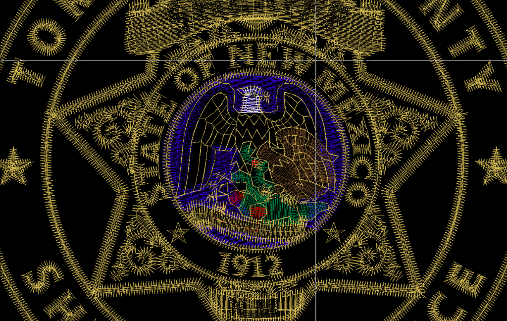
Full coverage, blending, and 3″ in diameter, but supple and light; that’s due to balanced densities. Even in the blended areas, the design never goes tighter than .4mm spacing, and there are spaces made in underlying layers for top stitching wherever possible.
If a design is overly dense, it makes the decoration inflexible and heavy, hurts the drape of the material and can make it uncomfortable to wear.
Though sparse designs that don’t cover the ground may look poor, simply adding more density to your top stitching until you obscure the substrate isn’t usually the right answer. An overly dense design may shine and have solid colors, but if it is so stiff with excess thread that it won’t bend, or has so many layers of small dense details that the inside of the design is studded with lumps and knots, it’s not a great apparel design. Once again, this isn’t just a matter of preference or even just economy, though excessive stitch counts do slow up production; this is a matter of how the garment feels and functions for the wearer.
When our decoration is too stiff to conform at all to the body beneath it, when its technical flaws frustrate embroiderers, or it requires excess stabilizer to maintain registration, we as digitizers have failed, no matter how beautiful it looks when we coddle it through our sampling run.
What’s good for upholstery isn’t necessarily good for performancewear. Designs should conform to their end use.
For commercial digitizers, the answer is simple, though it takes dedication. Even as we attempt to push the artistic envelope, we can’t forget the basic needs of the machines and garments on (through) which we stitch. We must remember our foundational skills: Use only the stitches needed to cover the substrate, using underlay to help lift the top stitching and obscure the base. Path logically and eliminate as much unnecessary movement as possible. Only jump, trim, or change colors when maintaining registration or properly layering elements requires it.
Most of the garments our embroiderers stitch aren’t high-fashion or ceremonially worn- they are meant for daily wear. These commercial embroiderers have to make money on thin margins and produce durable, good-looking garments, but they must also be comfortable to ensure the customers’ experience keeps them coming back for the next order. If we want embroiderers to be as successful as they can be, we have to realize that the care in our work enables them to run efficiently and provide the best customer experience.

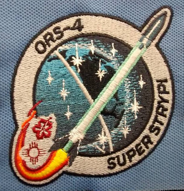
It’s not a perfect rendition, but it runs well on performancewear, wears well, and represents the client’s most important elements.
Though it seems fussy, minding these technical considerations isn’t a ban on creativity; I think they help foster a more refined kind of work. There is more than the beauty seen on the surface of a design; there is a beauty in the graceful movement of the machine when a design is efficiently made, a beauty of the easy flow of garments through the production process, and a beauty in the way a customer can literally feel the quality of our work. When we fulfill all the conditions that define the best commercial embroidery digitizing, we enhance the experience not only for the viewer of our designs, but for the operator who runs them and the customer who wears them.

Hello Erich. This is my first time reading your blog. I feel like an angel has led me here. I’ve been digitizing for about 8 years now and my current software, Floriani Total Control U went through a “divorce” so to speak from G7 Solutions. In that process, the software seems to have suffered and I can no longer feel confident with my end product. So my business partner and I have purchased the Wilcom Elements 3 with Corel Draw. Now I feel like I’m in over my head. So I will be so grateful to have your blogs as a guide or tool so I can return to the level of digitizing that makes me happy again.
I’m very glad my blogs could be useful to you, Angie! I’m not very familiar with Total Control, but I’ve been a Wilcom digitizer for a very long while and I know it’s an incredibly capable set of tools. If you like the content here, you may want to check my LinkedIn profile for a more complete list of all of my industry articles from magazines like Printwear. You’ll find it here: https://www.linkedin.com/in/erichcampbell
Thank you Erich. I will take a look at the linkedin site.