


Embroidery is a textural art, but the texture of the substrate sometimes interferes.
The texture of embroidery, in short, its ability to play with light and shadow is one of its greatest assets. Sadly, when the fabric on which you embroider is excessively textured, you may find your embroidery obscured and sunken into the material. I’ve written about the topic many times, most famously in Printwear Magazine, both in a general sense and with a specific eye toward the problems had decorating terrycloth, but in all instances, the question is the same; what can I do to make my machine embroidery stand out when applied to textured substrates like toweling, fleece, fur, and even ribbed knits?
Luckily, the answers aren’t as difficult as you might think, especially if you have access to basic digitizing software. If we visualize how our embroidery interacts with the materials on which we stitch, we can not only tame texture, but use it to our advantage- we’ll identify the kinds of material you are likely to encounter and give you techniques to tackle each type; in this installment, we’ll start with high pile materials, saving ribbed knits for Part 2.
Type #1 – High Pile
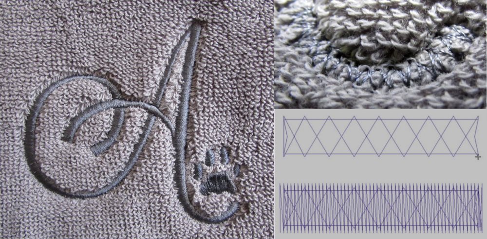
Even this fine toweling could have swallowed these 4mm letters without support.
This is the most likely culprit; when the material is furry, covered in loose loops, or has fiber sticking up from its surface, it’s likely a high pile material. Plush fleece, furry holiday stocking cuffs, bathrobes, towels, and carpet-like dash mats all fall into this category. When these are embroidered, fibers may poke through designs, and small elements can be hidden fibers at the edges of each element tower over them, and edges may look rough, unless we tame the texture.
Taming High Pile Fabrics
Tactic 1: Support Stitches
Designs with small, unsupported elements benefit from the use of a field of support stitching run before the main design. When I first taught my method, this was entirely a manual affair; I created my support stitching with the same digitizing tools used to create my design; current home embroiderers, however, often have an automatic, one click method for creating this field of support stitching. The samples I’ve seen create a filled element that extends a couple of millimeters outside of the selected design, meant to be stitched in the color of the fabric below. This technique is very useful and even the automatic method works well- it’s very much like the method I have always prescribed, the ‘light mesh fill’ but with some very important differences.
The automatic method I’ve seen does some variation of the following: It creates a shape behind the design, filled with a single pass of ‘tatami‘ or ‘fill‘ stitches, commonly at a density/density of .6mm (6pts) apart with a stitch length of around 3.5mm at a 45 degree angle. With these settings, a 1 inch square area will add roughly 725 stitches to your design.
This thick terrycloth wristband was easily tamed by the light mesh fill.
My method is what I’ve always called a ‘light mesh fill‘ – rather than creating either a full-density block, or using the settings above from the automatically created support stitching that I described earlier, the light mesh fill consists of two passes of a much lighter fill or tatami stitch to create what looks like a mesh netting. Each pass uses between 2 and 3mm (20 to 30pts) spacing/density, depending on how fine and loose the fibers of the substrate, with both passes at a 3-4mm stitch length. I almost always manage a clean, flat surface with the 3mm spacing- only with the most disagreeable fabrics do I need to add more density.The first pass is at 45 degrees, much like the automatically-created stitches, but the second pass returns in the opposite direction at a 135 degree angle, forming a netting-like mesh over the loose fibers. 1 square inch of my lower-density light mesh fill adds only 370 stitches to the design, holding down the offending pile without creating excess density and leaving the material very pliable.
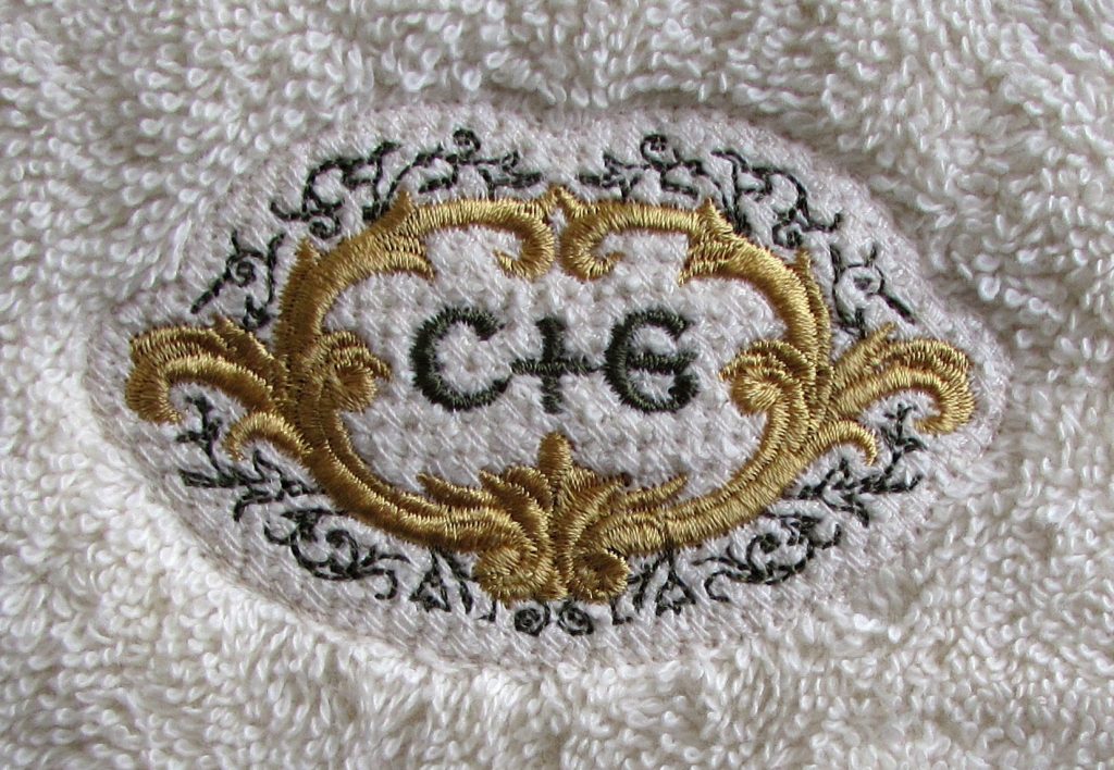
Even on this highly plush towel, a light mesh lets small straight-stitched detail stand out.
The second benefit to the mesh fill is that thin, straight stitched elements won’t fall into the grain of the background stitching; with any fill at a single angle, stitches on top of the fill that follow the same angle may ‘fall in’ to the grain of the background, between the rows of fill. With the mesh, even single-pass straight stitches are supported, no matter their angle. The takeaway is this; the automatic version is often a little smoother in texture, but it does add more stitches than the light mesh, and does have a directional grain that might interact with extremely fine detail. The light mesh is less dense, provides a more structured base, and is a little more sure to capture the wildest fibers, but it is a bit more visible in the finished product. It’s up to you which method works best for your particular project.
Towel Tip: For towels and other non-shiny substrates, use a matte-finish thread like Madeira’s Frosted Matt or even a cotton-blend thread to allow the mesh fill to be even less visible.
Structural Underlay
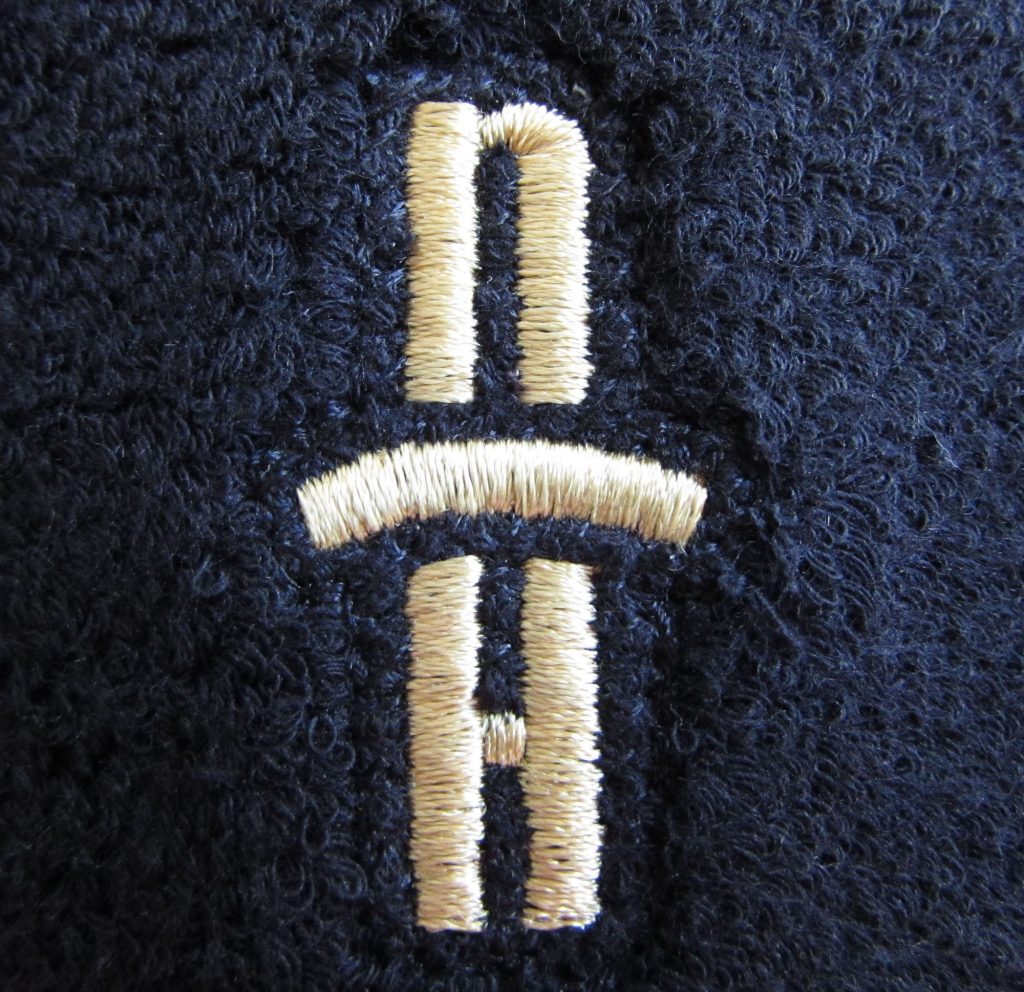
Thick monograms may be able to stand on their own with structural underlay holding down the pile, but they can have issues with edge visibility.
Designs with large freestanding elements, like large monograms, can simply use a heavier, structured underlay and extra pull compensation. A common structural underlay is sometimes referred to as a ‘German’ underlay, and consists of an ‘edge walk’ or ‘contour’ underlay followed by a tight ‘double zigzag’ underlay. The way this structure works is easy to understand: picture yourself standing beside your design like an ant standing on the hooped material. The double zigzag would be like planks, laying over the ‘rails’ of the edge walk to build a loose boardwalk over the substrate, lifting the top stitching as well as holding back fibers that bristle from the surface, while the edge walk gives a secure ‘edge’ for the top stitches to ‘grab’ as they pull taut, while also helping to fill any edge gaps or sawtoothing.
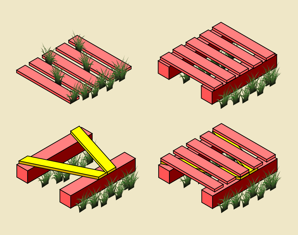
Edge-Walk + Zig-Zag + Satin Stitch- like a boardwalk over a grassy field.
Sticking with Supplies?
Wash-away dissolving films can help keep the fibers down long enough to stitch over the design, but they’ll disappear with washing. If the stitching doesn’t hold down the pile, fibers may escape with wear. Some use permanent tearaway toppings; these are best used under filled elements with satin-stitch borders that allow you to tear away the topping before stitching that clean, satin edge. I’ve never needed them, but for those who don’t digitize they may be helpful in reducing fibers breaking through designs, though they can’t stop fibers from creeping over the outer edges of the design.
Add Applique!
Place an overall applique behind your design or in lieu of filled areas in your design. Applique is sure to hold back any surface and unless you apply a textured material, will provide a smooth, uniform surface on which to stitch.
To clip or not to clip?
In the commercial world, I’d never dream of trying to shave, clip, or trim textured fabrics- at scale, it adds too much labor and mess, even if I weren’t concerned with possible damage to the embroidered item. Depending on the material, trimming or clipping may even contribute to runs or unraveling. I would avoid it.
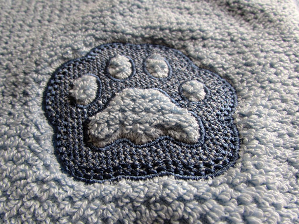
This embossed paw makes for puffy pads on a thick pet towel.
Letting the Texture Triumph: Embossing
Though we’ve maintained the fight against stray loops and fibers to this point, the other options is to go with the flow and redirect that wild texture. We can use it to our advantage with a technique popularly known as embossing. This style intentionally creates negative spaces in the design, through which the pile erupts; the texture and height of these open shapes become primary design elements, providing a wealth of light and shadow as well as textural contrast.
The open areas are most impressive when left large and simple in profile. A thick-stroked monogram or simple shape standing tall in a flattened field of fill and surrounded by a satin border makes the textured pile the star of the show. Tone-on-tone color schemes are the most usual method for executing these light, production-friendly designs. As long as you provide a large enough negative space for the pile to really stand out, your imagination is the only limit to what you can emboss.
Stay Tuned!
In Part 2 of Taming Texture, we’ll move from towels to toques as we learn how to handle ribbed knit fabrics, with tips on how to master the grain, keep things from shifting out off control, and stabilize the stretch!
Great article! The suggestion to use a mesh running two directions makes a lot of sense. I’m confused about the ant POV illustration, though. The bottom two graphics show the described “German” underlay, and the upper left shows satin without underlay (which is clearly problematic because the grass shows through). What about the upper right (which looks like edgewalk but no zigzag)? Is it an (equally effective?) alternative to the German method?
Glad you liked the article!
The POV illustration wasn’t necessarily supposed to be taken that literally- It simply tries to show how edgewalk elevates top-stitching one level, and then the second with the single zigzag of planks shows that a zigzag further raises the top stitching and covers more of the ‘gaps’ in the ‘boardwalk’ of the top stitching to show how a zigzag, (and by extension a double zig-zag) increases coverage. Showing a double zig-zag of planks looked cluttered when I created the example and it didn’t make a ton of sense physically, so I decided just to illustrate a single zig-zag to make it easy to see and ‘read’ what I meant. Sorry for the confusion!
Very interesting article, when is Part 2 coming out?
It’s out now! http://www.erichcampbell.com/taming-texture-how-do-i-embroider-knit-hats-beanies-caps/ Hope you like it, Sara!
Pingback: ErichCampbell.com Taming Texture Pt. 2: Embroidering on Knit Hats / Beanies - ErichCampbell.com
Pingback: Embroidering on textured knit items
Great article!!!! One of the most informative and useful articles i have ever read. I recently started making my own knockdowns with 2- 24mm density placing the second layer at a 90 degree angle and i really like the results. I must try your angles for even better results. Thank you for taking the time to share your expertise!!!

can’t wait for part 2. Great Lesson. Thank you
It’s finally here! http://www.erichcampbell.com/taming-texture-how-do-i-embroider-knit-hats-beanies-caps/